Interior design of the 43m2 apartment, Søborg, Denmark.
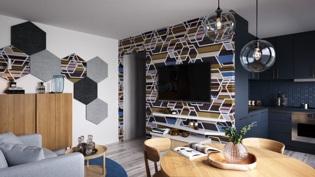
From a small apartment without a shower and a dining room, to a modern interior where everything is nicely packed and enriched with interesting textures and materials, so it fits the mother with two children.
Last month Mind design had a very interesting task in Søborg, Denmark. In a two stories building we faced one small apartment which main problem was that it had no shower and no place for a dining room. Apartment belongs to a modern mother with two kids, that are spending their time with the mother every other week, so we had to make an adaptable interior so that everyone has their own privacy, but also that the mother, when she is alone, has all the necessary zones in the apartment: living area with kitchen, living room and dining room, and night zone with separate bedroom.
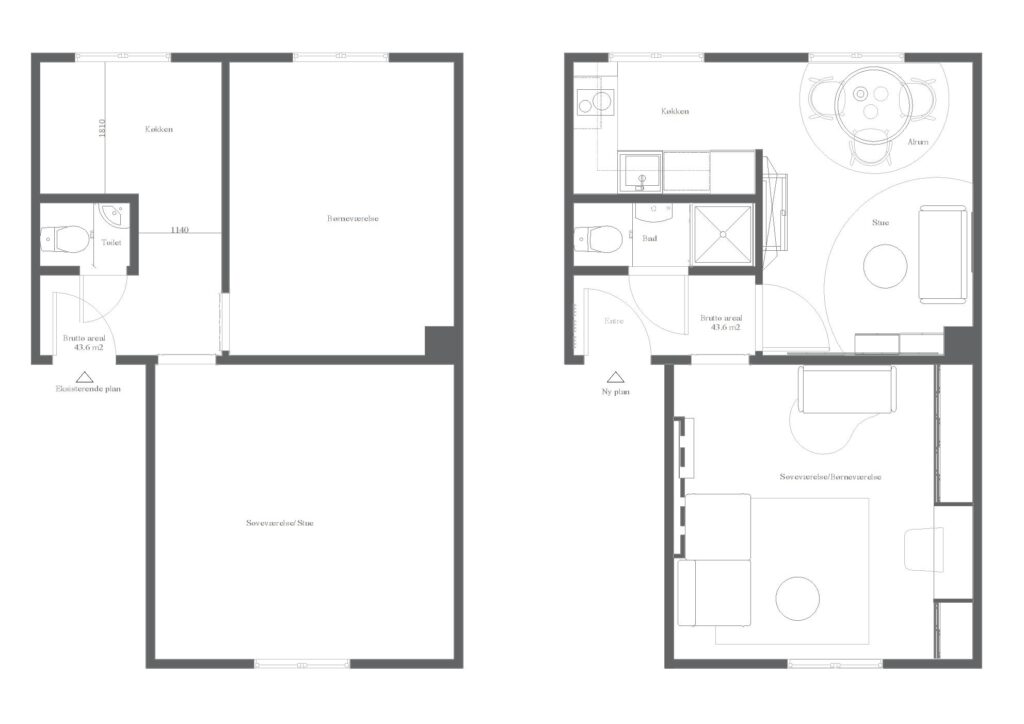
On the left floor plan it can be seen how apartment looked like before we stepped in. There was a small entrance with a conflict situation between the front door and the toilet door and there was a tiny toilet without a proper shower. Living room was also a dining room and a bedroom for mother. Brother and sister shared a smaller room, but every other week that room was empty and useless, so Mind design decided to reorganize the space and make this interior cozy and functional.
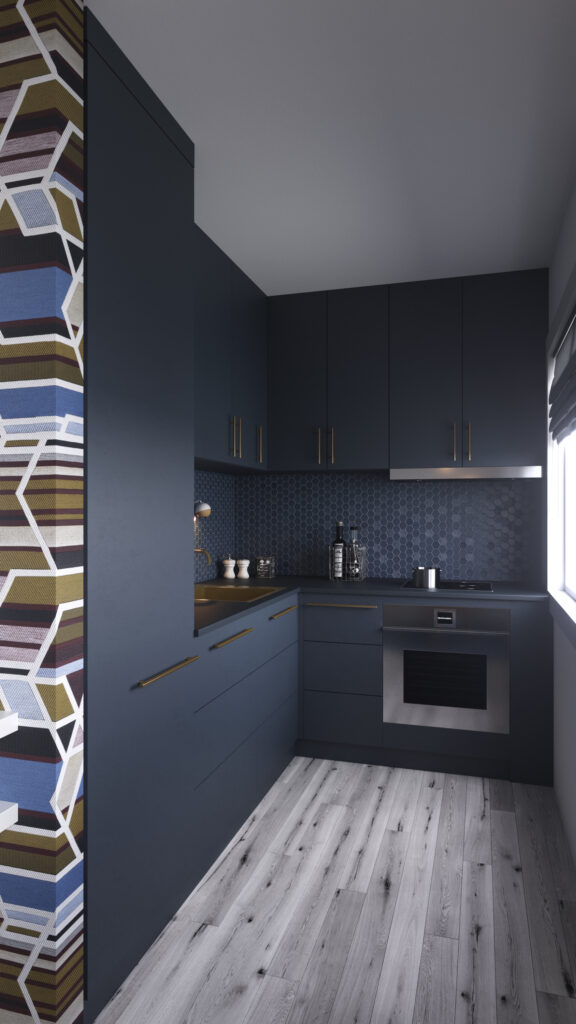
We decided to make this apartment unique and modern with eye catching details, so we started with the hexagon pattern and deep blue mat kitchen fronts.
First, we made a bathroom with the shower and closed the entrance to the kitchen from the hallway. That gave us a logical solution for organizing a living room area and the kitchen. Nice round table with three chairs and a little sofa makes this room multifunctional and provide nice day zone for both kids and mother. The biggest room in the apartment is usually a living room, but not in this case. We made a biggest room as a kids room but also as a bed room for mother. It is also the room where all the wardrobes are. Between them, we made a small office area that can be used as a school table and a place where mother can work.
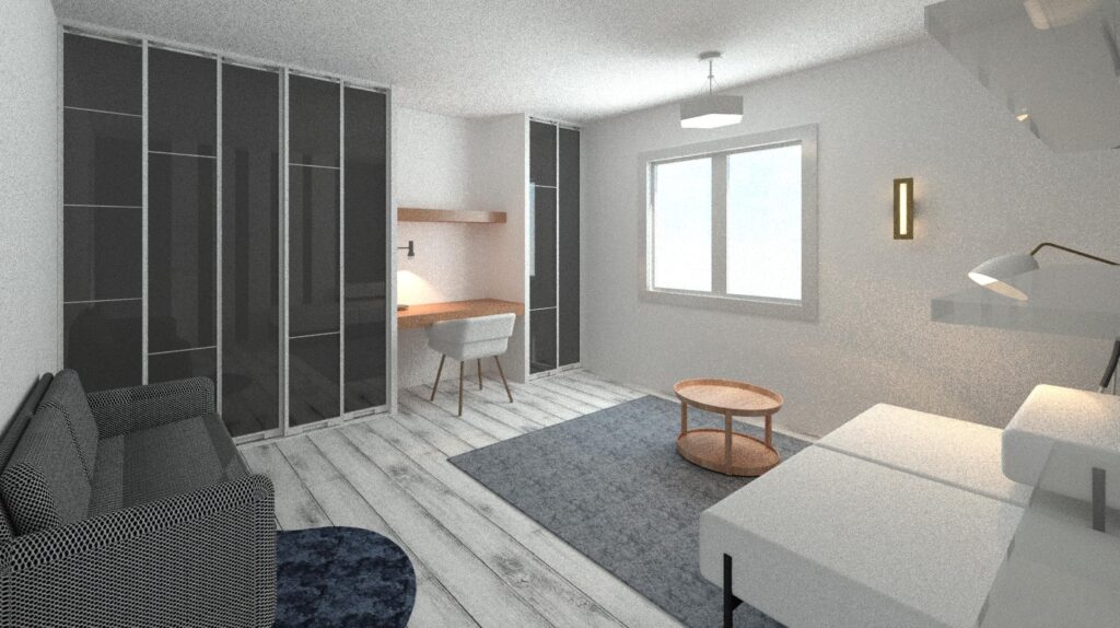

In the bedroom we put the gypsum vertical stripes with the light behind them so the atmosphere in the room can change with the changing the purpose of the space.
In the small apartments usually designers use light and bright colors and a simple wall finishes. But we decided to make this apartment unique and modern with eye catching details, so we started with the hexagon pattern and deep blue mat kitchen fronts. Between the elements we used hexagon tiles in the matching color. Golden details were perfect in this combination and that indicated also a wall finish in the living room. With the double sound insolation under the textile covering, and with hexagon sound dumpers on the near wall, this room became a little paradise.
There is no Scandinavian interior without wood, so we used wood as a main material for the rest of the furniture, and of course, for the floor.

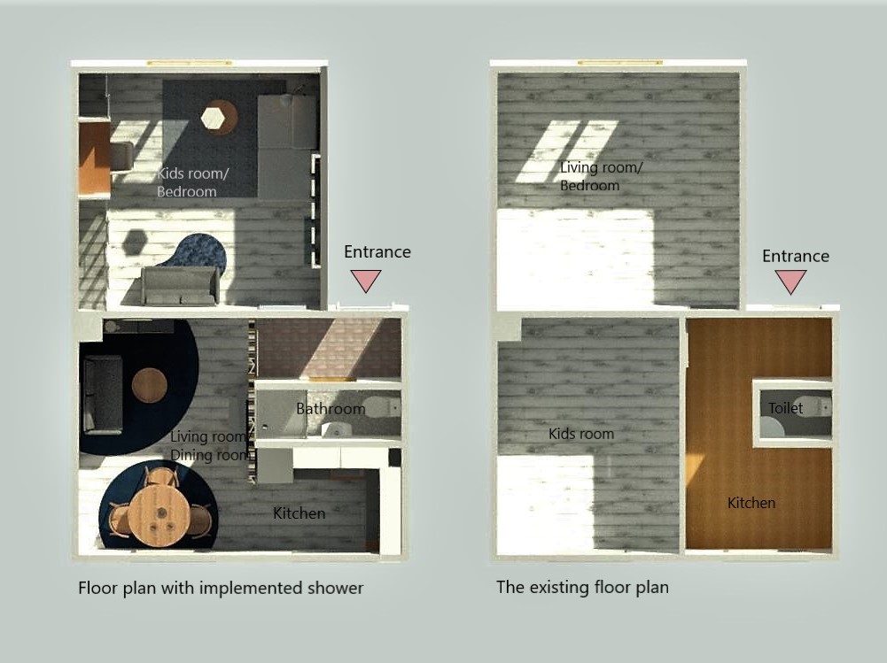
On the end, we made a beautiful living space for this family, and a functional floor plan with several advantages like: bathroom instead of a small toilet; kitchen with dining room and living room together, instead of dining table away from kitchen; day and night zones divided physically and acoustically.
Follow us for more details and projects like this, and contact us if you have some interesting task for us! We are here to make your home be your paradise!
Your designer,
Kristina Janka


